Create a scatter plot for interval-valued symbolic data, visualizing the symbolic data as rectangles or crosses, with the first two variables on the x and y axes. The function allows customization of colors, fill colors, and outlier representation.
Arguments
- data
An
intDataobject containing the macrodata/interval data. The first two variables are used for the x and y axes.- type
The type of plot to generate: "rectangles", "crosses" or "crosses2". Default is "rectangles".
- palette
A vector with colors for each observation. Default is
rainbow(nrow(data)).- fill_col
If
type="rectangles", a vector with colors for the fill of each observation, or a single color for all observations. Default is "gray50".- is_outlier
A vector with logical values indicating if the observation is an outlier or not. It makes the line width of the outlying observations thicker. Default is NULL.
- ...
Additional graphical parameters.
Value
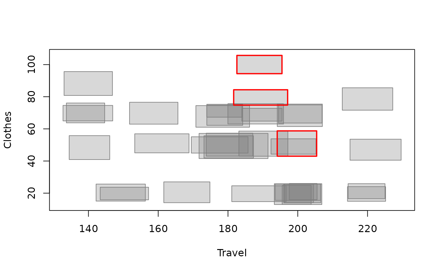
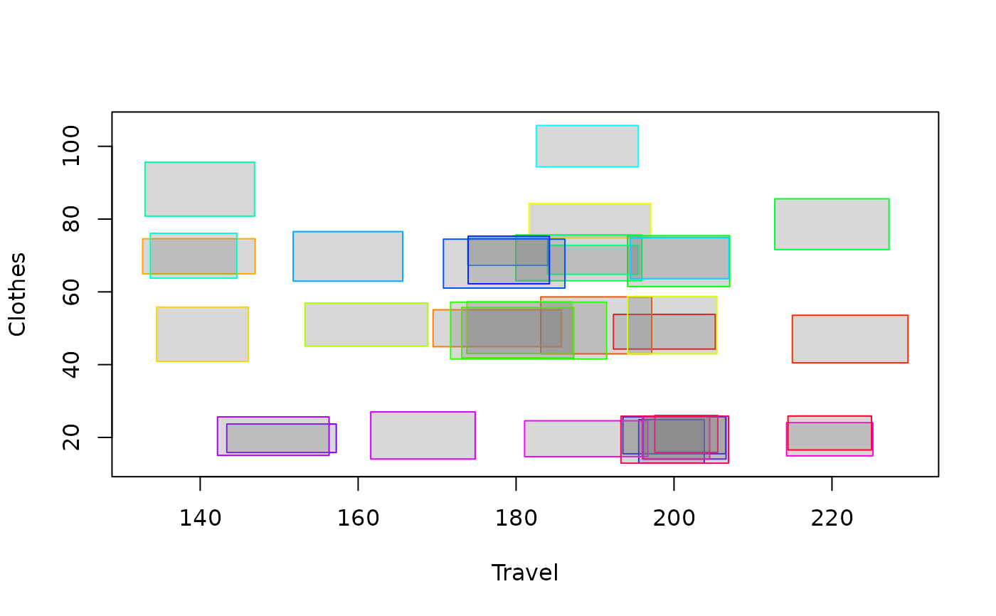
A scatter plot is drawn in the graphic window. The scatter plot shows the symbolic data as rectangles or crosses, with the first two variables on the x and y axes.
Examples
data(creditcard)
credit_card_int <- creditcard$intData
plot_scatter_int(credit_card_int[, c(3, 5)])
 # Alternatively, highlight outliers in the scatter plot
# Compute robust distances using IMCD estimates of mean and covariance
credit_card_dist <- IMah_dist(credit_card_int)
# Detect outliers using farness cutoff
credit_card_outliers <- int_outliers(credit_card_dist, "farness", 0.9)
outliers_colors <- rep('gray50', credit_card_int@NObs)
names(outliers_colors) <- rownames(credit_card_int)
outliers_colors[credit_card_outliers$outliers_names] = 'red'
plot_scatter_int(credit_card_int[, c(3, 5)],
palette = outliers_colors,
is_outlier = credit_card_outliers$is_outlier)
# Alternatively, highlight outliers in the scatter plot
# Compute robust distances using IMCD estimates of mean and covariance
credit_card_dist <- IMah_dist(credit_card_int)
# Detect outliers using farness cutoff
credit_card_outliers <- int_outliers(credit_card_dist, "farness", 0.9)
outliers_colors <- rep('gray50', credit_card_int@NObs)
names(outliers_colors) <- rownames(credit_card_int)
outliers_colors[credit_card_outliers$outliers_names] = 'red'
plot_scatter_int(credit_card_int[, c(3, 5)],
palette = outliers_colors,
is_outlier = credit_card_outliers$is_outlier)